Statistics and Probability Overview III
In statistic and probability overview I & II, we covered regression analysis, timeseries analysis, Monte Carlo Simulations, Markov Chains, hypothesis testing, confidence intervals, parametric tests, non-parametric tests, p-values, effect-size, and inferential statistics by bootstrapping. In this piece, we explore Probability, Permutations and Combinations, Probability Distributions, and Data Visualization.
Probability
It is the likelihood of an event happenning i.e. the proportion of times an event occurs during a random process e.g. 1/6 for a 5 in a dice. Probability values range from 0 to 1, where at zero the event cannot happen and at one the event will happen. Other common terms for probability include chances, odds & likelihood.
Due the law of large numbers as the number of trials increase, the observed proportion converge on the expected probability.
Calculating probability
A simple coin toss has only one way the event can occur and it has two possible outcomes.
- P(H) = 1/2 = 0.5.
A rolling die, can have different events e.g. find a 6, find a 2 or 3, or find an even outcome?
- P(6) = 1/6 = 0.167
- P(2 or 3) = 2/6 = 0.33
- P(Even) = 3/6 = 0.5
From a full deck of cards, what are chances of getting a heart(H), a King (K) and a King of Hearts (KH)
- P(H) = 13/52 = 0.25
- P(K) = 4/52 = 0.077
- P(KH) = 1/52 = 0.019
Unlike a coin toss or rolling a dice, drawing a card is not an independent event, each successive card removed from a deck affects the likelihood of the next card.
Two branches of probability theory
- Frequentist or objectivist
The likelihood of a random event defines the relative frequency of their occurence in experiments. It is the basis of hypothesis testing, probabilities are long-run proportions that can be calculated using repeated observations in experiments.
- Bayesian or subjectivist
This branch combines belief from expert opinion together with experimental data to produce likelihoods. The process produces a posterior probability distribution that defines the chances for a particular outcome.
Trade-offs: frequentist do not rely on expert opinion which can be a good source of relevant known information, whereas bayesians poor sources of information can affect outcome
Conditional Probability
The likelihood an event occurring given that another event has happened. Knowing an event occurred can change the probability of an outcome of another event.
- P(A|B): conditional probability of an event A occurring given that B has occurred e.g. P(Married|over30)
- | A*B (joint probality): a subset of cases where both events happen.
Given a person carries an umbrella 20% of the time when it is raining, 40% when there is no rain, and it rains 25% of the time and there is no rain 75% of the time.
Conditional probability for independent Events (1/6=0.167):
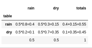
Probability Example It rains 50% of the time, forecast predicts rain correctly 80% and predicts dry weather correctly 70% of the time.
- What is the probability there is rain after a rain forecast?
- What is the probability there is rain after a dry forecast?
Joint probability contigency table:
Conditional probability:
P(A|B) = P(AB) / P(B) | whereas P(B)=trueB + falseA
Permutations and Combinations
Combinations: a sequence of outcomes where order does not matter
Permutations: a sequence of outcomes where order matter
Given A,B,C, we can have a combination ABC=ACB, but as a permutation ABC CBA. Permutation of ABC has outcomes.
Combinations with Repetition
Given 6 choices that can be repeated 3 times:
n=number of options, r=size of each combination, !=factorial
Combinations without Repetition
Selecting different combinations of 5 people from a total of 30 people:
Combination Probabilities
Powerball has 69 white balls in which 5 are randomly selected, each ball is drawn once and the order does not matter.
Permutations
Order of outcomes does matter e.g. password 1-2-3 3-2-1
Permutations with repetition
Given 0-9 = 10 values, to create a 4 digit pin e.g. 1-1-2-3
Permutations without Repetition
Given 10 books, how many possible ways can they be arranged on a shelf?
Partial Permutations without Repetition
How many different ways can we arrange 5 books from a total of 10 books?
numerator: all possible permutations, denominator: permutations we are not interested in
Permutation Probabilities
What is the probability that a 4-digit PIN does not have repeated digits?
Odds Ratio
It relates a grouping (splitting) variable or a continuous variable with an event that has two/binary outcomes. When the variable is continuous, the odds ratio determine whether the likelihood change as the continuous variable change.
The ratio tells how much more or less likely the numerator event is likely to occur relative to the denominator event (control/baseline)
100 people visited a zoo, 36 got sick and 64 did not. Out of the 132 that did not visit the zoo, 9 got sick and 123 did not. Cases=36,9, Controls=64, 123
Those who became infected(cases) were 7.7 times more likely to have visited the zoo than those without symptoms (controls)
For binary logistic regression, odds ratio are given for continuous independent variables. Given a Unit of Change=0.1 and Odds Ratio=2.7, it indicates that for every 0.1 increase in the continuous variable, the event is 2.7 times more likely.
As a continuous variable increases;
- Odds ratio > 1: more likely to occur
- Odds ratio < 1: less likely to occur
- Odss ratio = 1: the likelihood of an event does not change
Odds ratio can be used in testing hypothesis. The null states the odds ratio equals to 1 (no relationship). If the p-value for the odds ratio is less than significance level, reject the null. Alternatively, we can use the confidence intervals for odds ratio, if it excludes 1 then the results are statistically signficant.
Probability Distributions
A statistical function that describes all the possible values and likelihoods that a random variable can take within a given range. Probability distribution shows the expected outcomes of possible values for a given data generating process. The probability distribution shapes are determined by the distribution's mean, standard deviation, skewnesss and kurtosis. Probability distributions are used to describe and predict the probability of an event.
The probability distribution is plotted using a probability density function (PDF). Probability of occurences are added up cumulatively, and plotted using a cumulative distribution function (CDF).
Normal Distribution
It is also called the Gaussian distribution that is described as the bell-shaped curve. Normal distribution is a continuous probability distribution that is symmetric around the mean, it has a central peak and probabilities of values further away from the mean fall-off equally in both directions. Not all symmetric distributions are normal e.g. Student's t,Cauchy and logistic distributions. Many natural phenomenas follow normal distribution e.g. weight, blood pressure, measurement error(clm).
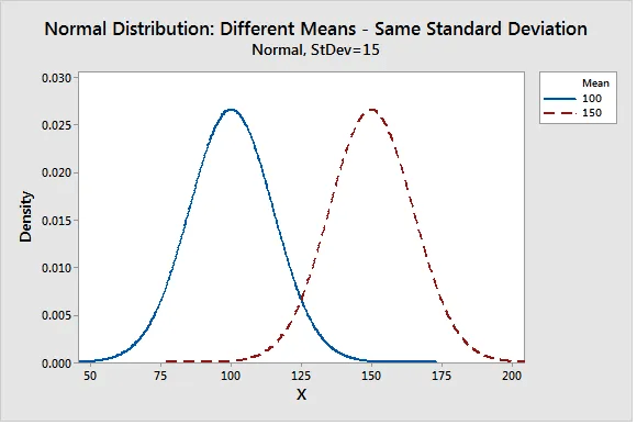
The normal distribution has two parameters, the mean and standard deviation. The mean defines location of the peak.
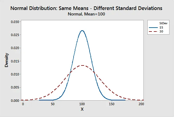
The standard deviation determines the typical distance between the observations and the average.
As the spread of the bell curve increases the likelihood that observations will be further from the mean also increases.
Properties of a Normal Distribution
- They are symmetric bell curves (not skewed)
- The mean, median, and mode are all equal
- Half the population is less than the mean and half is greater than mean
For skewed continuous data, the distribution is likely weibull, lognormal, exponential or gamma
The empirical rule of Normal Distribution
The standard deviation can be used to determine the proportion of values that fall within a specified number of standard deviations i.e. 1 = 68%, 2 = 95%, 3 = 99.7%.
Given pizza delivery time is 30 min and a standard deviation of 5 minutes.
- 68% of deliveries will be done in , between 25-35 minutes
- 95% in , between 20-40minutes
- 99.7% are in , between 15-45minutes.
Standard Normal Distribution (Z-distribution)
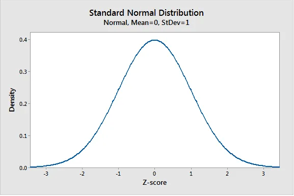
A standard normal distribution also called the z-score represents the number of standard deviations from the mean e.g. z-score=1.5 is an observation that is 1.5 standard deviations above the mean. It is a popular form of normal distribution with a mean of zero and standard deviation of 1.
Standardization
Enables taking normally distributed populations with different means and standard deviations and comparing different types of observations based on where each falls within its own distribution. This is done by taking a raw score, subtracting the mean and dividing by the standard deviation.
Assuming an average weight of an apple is mean=100, std=15 and an orange average weight is mean=140, std=25. We can calculate the z-score for a single apple weighing =110, and an orange weighing=100.
From the results, the apple has a positive Z-score(0.667), meaning it is slightly heavier than an average orange that has a z-score of the mean=0. The orange has a negative z-score(-1.6), meaning it is far lighter than an average orange which has a mean=0.
Area under curve: the weight percentile for apple(0.667) on a positive z-score table is z-score(0.66)=0.7453. The apple is approximately at the 75th percentile (75% of oranges weight less).
Binomial Distribution
A binomial distribution is a discrete probability distribution that calculates the probability an event will occur a specific number of times in a set number of opportunities. The distribution is used with events that have binary outcomes that are mutuall exclusive. The probability for exactly X events in N trials when the probability of an event is known.What is the probability of getting; 5 heads in 10 tosses, 3 defective products in 100, 3 flu outbreaks in 5yrs.
| where n=number of trials, p: event success probability
| where x=number of sucesses
Assumptions for a Binomial Distribution
- There must be only two possible outcomes per trial e.g. sale or no sale, pass or fail
- Trials are independent thus outcome of one trial does not affect the subsequent trial
- The probability remains contant over time, when it changes use a control(P) chart to confirm
The probability of rolling exactly 3 sixes in 10 die rolls? n=10, X=3, p=1/6=0.1667
The binomial Cumulative Distribution Function (CDF) calculates the likelihood of obtaining less than or equal to X events in N trials. To calculate the probability of getting at least(greater than or equal) 3 sixes in 10 tosses. Calculate probability of 1 - P(2) - P(1) - P(0)
Bernoulli distribution is the outcome of a single trial of the event, whereas Binomial distribution is about the outcome of multiple trials of the event
Hypergeometric Distribution
Similar to binomial distribution it calculates X events in N trials, however in hypergeometric we are drawing from a small population without replacement thus we do not assume the likelihood of an event occurence is constant. If you have green, blue and red candies in equal amounts in a jar containing 15 candies. The probability of selecting a red candy is 1/3 at the beginning, every time we extract our favourite red candy, the probability of picking one decreases.
Hypergeometric distributions for a deck of cards
What is the probability of 2 spades in a 5-card poker hand? N=52, A=13, n=5, x=2, (A x)=aCx
The probability for at least 2 spades is given by:
Hypergeometric distribtuion is binomial distribution without replacement
Poisson Distribution
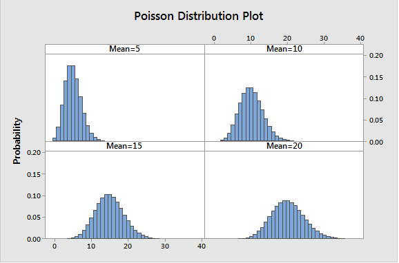
A discrete probability that describes the probability for count of events in a given space e.g hour, batch, country. It is defined by lambda (), which is the number of occurrences during an observation unit. To estimate a samples lambda, we use the average rate of occurrence which is the mean count per observation period.
Poisson distribution is applicable to counts of independent events with an average rate of occurence that does not change. The Poisson Rate Tests is a hypothesis testing method that can be used to determine statistical significance of complaints per day between two stores. As the lambda increases to above 20, the data becomes less skewed and a normal distribution can be used to approximate a Poisson distribution.
Poisson and binomial distribution both model occurence of events, but Poisson does no place an upper bound on count per observation unit. For binomial, the number of events(X) cannot be greater than the number of trials
Poisson distributions for customer arrivals (events between time)
A shop serves 12 customers daily, what is the probability of serving exactly 10 daily? lambda=12, events=10
- The probability of serving more than 1 customer in the first 1hr? lambda=12/24=0.5
Exponential Distribution (time between events)
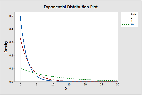
It is a right skewed continuous probability distribution that models variables in which small values occur more frequently than higher values. It can be used to model the amount of time between independent events that occur at a constant rate on average over time e.g. failure times. It is memoryless in the sense that the likelihood of when the event occurs next does not depend on when it happened previously. The distribution is applied in estimating length of phone calls, wait times, failure times, sales totals, pocket change.
Exponential distribution has 3 parameters;
- Scale: is the average time until the event occurs,
- Threshold: is the lowest value possible.
-
Decay or Hazard Rate () which gives the maximum value on the y-axis. It can be converted to a scale representing variability. An increase stretches the distribution to the right and height decreases.
Exponential, Poisson and Gamma distributions use the lambda parameter to represent the constant average rate of occurence for independent events. Exponential models the time(continuous) between events, Gamma models time until the (shape parameter) event occurs, and Poisson models the count of events within a fixed amount of time which is a discrete variable.
Probability of time between customer arrivals
A shop serves 3 visitors per hour, what is the probabilty a visitor arrives within 10 mins? x=10, 1v=20min, mu=20 and lambda = 1/20
- A visitor arrives after 30 minutes?
Gamma Distribution
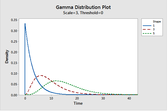
Similar to exponential which models time until the next event, but Gamma can model the elapsed time between various number of events. We can specify the number of events such as time until the 2nd or 5th event occurs. It used in modelling insurance claims(next accident), rainfall, cancer rates, wait, service & failure times. It has the shape, scale, and threshold parameters. The shape parameter models number number of events, to evaluate probabilities for elapsed time between 3 accidents .
When shape (events) increases the length of time grow. For very high events such as 300, the gamma distribution approximates normal distribution. The scale() or rate() parameter is the variability parameter representing the average time between events, if there are 5 days between accidents . A gamma distribution with shape=1 and scale=3 is equal to an equivalent exponential distribution.
Lognormal Distribution
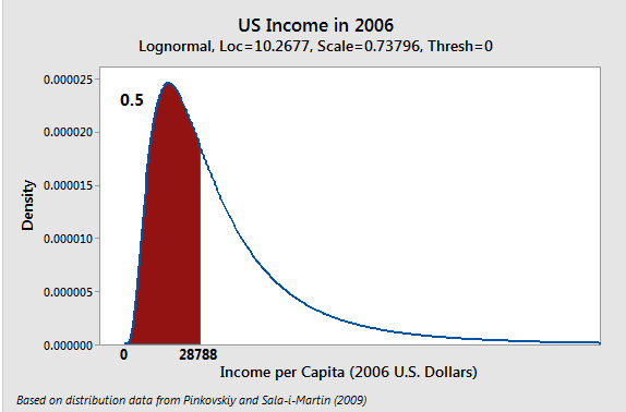
A continuous probability distribution that models right-skewed data, similar in shape to Weibull and loglostic distributions. It used to model growth rates that are indepedent of size in biology or finance. Another use case is time to failure e.g. species abundance, rainfall amounts. Taking the natural log(ln(X)) of lognormal distributed data will fit a normal distribution (logged distribution), similary the exponent(exp(X)) will give back lognormal data. For lognormal distributions the central tendency is better measured using a geometric mean than arithmetic mean.
Lognormal distribution has 3 parameters namely threshold, scale, and shape. Threshold is the minimum value, it shifts the distribution to the left or right. The location parameter is the peak(mean, median, and mode) of normally distributed data. In lognormal distribution raising gives the median.
The scale parameter() is the standard deviation of the normally distributed data.
Weibull distribution
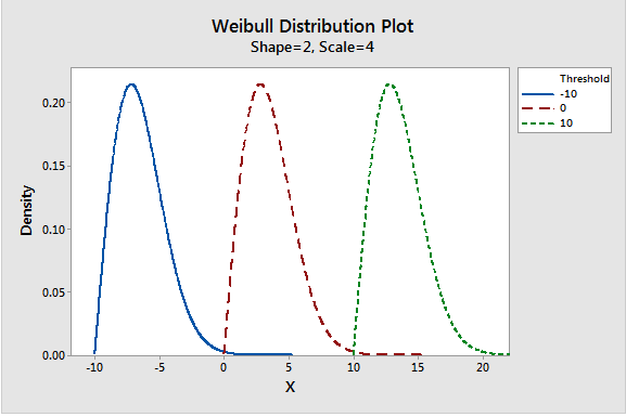
A continuous probability distribution that is similar to a normal distribution but it is more flexible as it can model skewed data. It has 3 parameters namely shape, scale and threshold. The threshold/location is the lowest possible value in the distribution. The shape value is the slope, at 2 the distribution is similar to Rayleigh/Chi-Square distribution with 2 degrees of freedom. The scale parameter is the variability, increasing the scale stretches the distribution to the right and height dereases. Weibull becomes a 2 parameter distribution when threshold=0, or shape=1.
Weibull distributions are used in detecting failure rates e.g. infant mortality or wear-out. If the shape is less than 1, the failure rate decreases and if equal to 1 then it stays constant over time.
Uniform Distribution
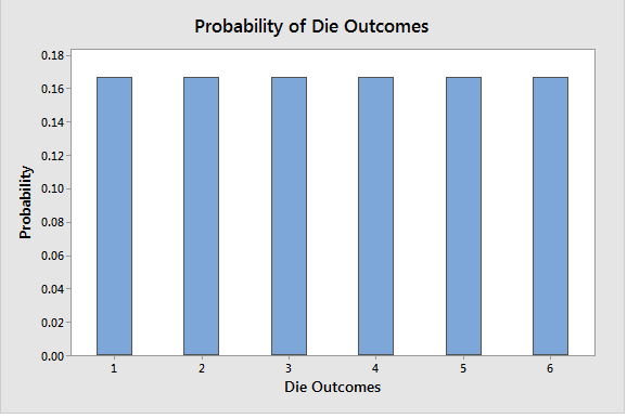
A symmetric distribution where all outcomes have an equal/constant likelihoood of occuring between the smallest and largest value in the distribution. They can be discrete like all sides of a dice or continuous with equal size range e.g. values that are equally likely to fall between 0.2-0.3 as 0.8-0.9. Example of Uniform distribution include dice & coin toss, random sampling.
Finding the probability of each outcome is 1/n i.e. 1/6. For continuous probability distribution, the area under curve is a rectangle e.g. distribution ranges between 5 to 10 is 1/5, therefore the probability of a value falling between 8-9 is 1/5 = 20%.
Identifying a Probability Distribution
Normal distribution is a familiar bell curve, but how would we identify a Weibull or a Gamma distribution. Data with one tail longer than the other is skewed. Some data sources are skewed for a good reason, measures with a lower limit tend to skew to the right and measures with an upper limit to the left.
Hypothesis test can be used to identify probability distribution where the null in the sample data follow a hypothesized distribution.
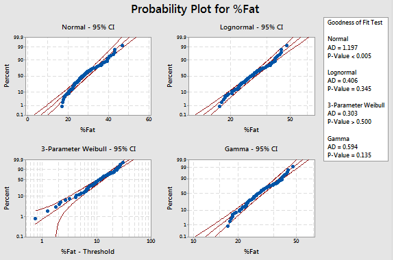
Goodness of Fit Test helps to identify distributions with the highest P-value as the best fit for the data. High P-values indicates that the data follows the distribution.
A Likelihood Ratio (P) determines whether a third parameter significantly improves the fit as compared to the associated two-parameter distribution, a p-value less than the significance level indicates signficant improvement over two-parameter distribution. If the threshold which is the lowest point is higher than our data values, then choose a different distribution.
Probability (Q-Q) plots visually shows whether the data points line up within the area of the fat pencil laid over the center straight line.
Data Plotting
Data is the information that we collect to learn, draw conclusions, and test hypothesis.
Levels of Measurement: Nominal, Ordinal, Interval & Ratio
Levels of measurement is a scale describing the type of information recorded in increasing order.
Nominal/categorical: data placed in groups without natural order e.g. gender. The central tendency is measured in mode, that is plotted in pie & bar charts.
Ordinal/rank: data placed in groups with natural but the difference between groups might not be consistent e.g. Education level. The central tendency is measured in median, dispersion is measured in range, IQR or spread between percentiles.
Interval: continuous data without a true zero measurement. We can add or subtract the values but cannot be multiplied or divided (ratio) e.g credit scores (300-850), Celsius. Central tendency can be measured in means and standard deviations, if skewed median and Interquantile range is preferred.
Ratio: continuous data with a true zero (lack of attribute) e.g. weight, Kelvins. We can add, subtract, multiply & divide.
QUANTITATIVE AND QUALITATIVE DATA
Quantitative/numerical data: numbers that represents objective measurement or a count e.g. weight. Quantitative data can be continuous or discrete.
Qualitative/subjective: information that cannot be measured in numbers is placed within countable number of groups e.g. taste. Qualitative data can be categorical, binary or ordinal
Quantitative Data: Continuous and Discrete
Continuous data: it can take any numeric value and can be meaningfully divided into smaller values including fractions or decimals.
Discrete data: it is a count of items or charateristic which cannot be meaningfully sub-divided into smaller units e.g. a car. It is best visualized with bar graphs.
A histograms or a dot-plot is a good way to visualize a continuous variable.
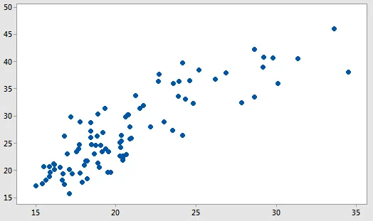
For two continuous variables, we can use scatter plots that shows correlation and strength of relatonship between them.
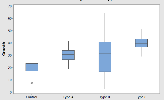
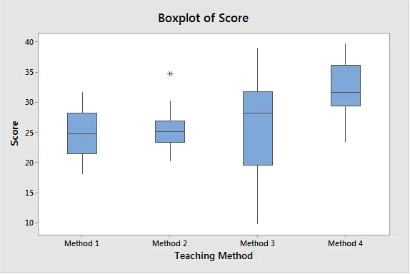
For continuous variables that are divided into groups, a boxplot helps display the central tendency and spread of each group.
Qualitative Data: Categorical, Binary, and Ordinal
Categorical/nominal/attribute data: values can be put into a countable number of distinct groups based on charateristics e.g. levels
Binary/dichotomous/indicator data: two groups e.g. gender
Ordinal: at least three categories with natural order e.g. rank
The conventional way to graph qualitative data proportions is bar & pie charts.
Pie Charts
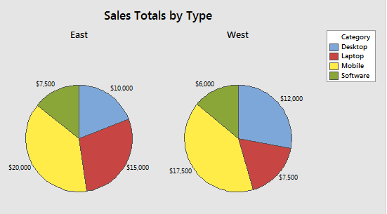
Used in assesing the relative sizes of categories to the whole dataset.The size of each slice is proportional to the relative size of each category out of the whole. The categories must add up to a whole.
Pie charts are not advisable to use when the categories are many or when visualizing categories that have sub-categories. To visualize more complex data arrangements bar charts are preferred as they have more options such as stacking, and clustering.
Bar graph/chart
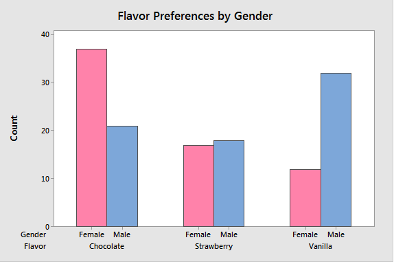
It compares categories when we have at least one categorical/discrete variable. Bar charts for multiple categorical variables helps understand the relationship between them. Summary values include sums, means and standard deviations. Unlike histograms (continuous data), bar charts have spaces between each bar.
Pareto Charts
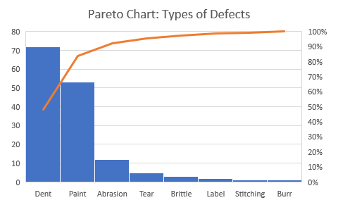
Approximately 80% of the outcomes originate from 20% of the causes. Pareto graph helps when we have many trivial causes focus on the critical areas. This is done by presenting bars from the left in descending order.
The first two categories account for approximately 80% of the defects.
Histogram
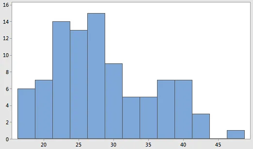
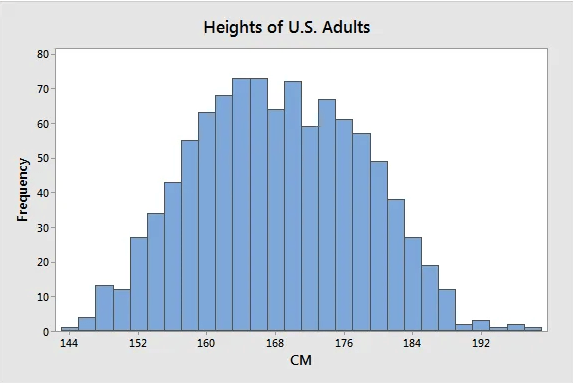
A histogram is a useful for displaying the distribution of continuous data. We take continuous measurements and place them into ranges of values called bins. Each has bar showing the count or percentage of observations that fall within it. Summary statistic, such as means and standard deviation do not tell the whole story about data. Histograms are good at visualizing dispersion, normality, outliers, skewness, kurtosis, peaks e.g. uni/bi/multimodal.
Histograms can confirm presence of subpopulations, and show how they differ from each other. In this graph of heights, the data appears to show an unusually broad peak at the center and it have hints of being bimodal.
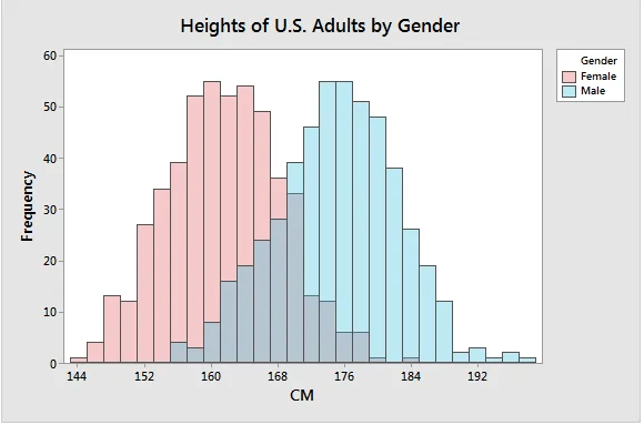
After dividing the sample by gender
It is clear that the data is bimodal, and the sample mean for each group is significantly different. This means that mean is a critical factor when studying heights, the mean of the whole population can be misleading.
Histograms are recommended for a large sample of at least 50 observations
Dot plots
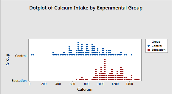
Same as histograms, dot plots display the distribution of continuous variables. They help compare distributions, check for outliers, uni/bi/multimodal, central tendency,skewness and variability in data.
The length of the stack indicates where most values tend fall and the width of the distribution is the amount of variability.
We see that Control has much lower calcium intake, and has extremely low values. A hypothesis test would be required to determine whether the differences are significant.
Empirical Cumulative Distribution Fuction (ECDF/CDF) Plots
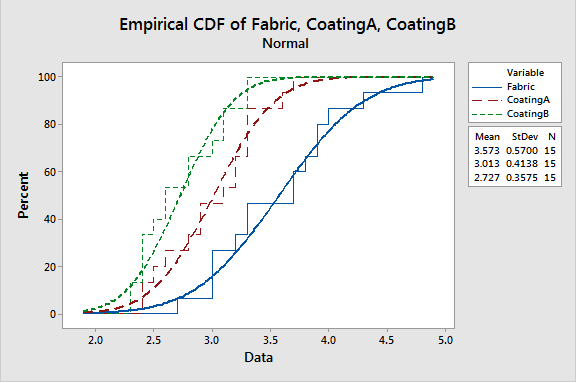
Used with continuous variables to compare different samples distribution of a characteristic starting from the lowest to the highest against percentiles on the Y-axis. The step function increases by a percentage equal to 1/N for each observation. It is important in studying percentiles, central tendency, variability and comparing probability distributions.
The slope for B steeper thus lower variability, and most common values are found steepest part of the slope. At 80% percent the samples are below 2.9, 3.4 and 3.9 for A, B, & Fabric respectively. The is a semblance of normal distribution, but QQ plots are better at determining whether the data fits a distribution.
Scatterplots / scattergrams
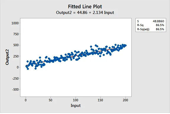
Show relationship between pairs of continuous variables. It shows the direction, strength, and linearity/curved of the relationship. if one variable increase as the other increases, the correlation is positive. Strong relationships produce high R-Squared values and correlation coefficients closer to -1 and +1, the data points tend to cluster more tightly.
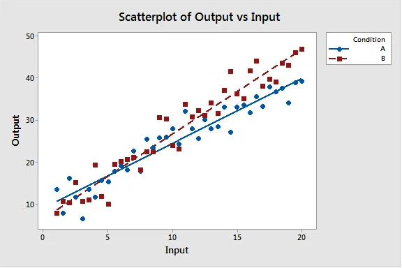
A categorical variable can create groups that we can compare the strength of the relationships using the same X and Y measurements.
As the input value increases the output for B increase more quickly.Line Charts
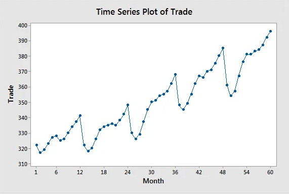
Line charts are similar to scatterplots except that they connect the data points with lines, and often the X-axis reflects time. A line chart has a continuous variable on the Y-axis and a continuous, time or categorical variable on the X-axis. They show patterns and trends and are able to show the main and interaction effects between variables.
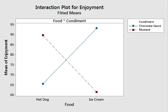
Line charts can help to visualize the interaction between variables
On the interaction plot, parallel lines indicates no interaction effect whereas different slopes suggest that one might be present. The crossed line suggest interaction between food and condiment, it shows that enjoyment levels are higher for chocolate sauce when food is ice cream. Conversely, satisfaction level for mustard is higher when taken with a hot dog.
Venn/logic/set Diagrams
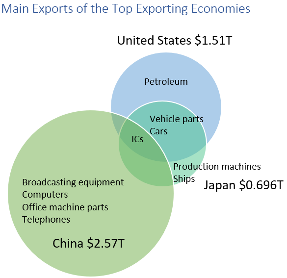
They display relationships between concepts using circles. Intersections indicate common elements, and non-overlapping areas traits that are unique to one set.
The size of the circle is proportional to the relative size of exports for each country. China has more diverse exports, US unique product is petroleum. All three export ICs, both Japan and US export vehicle parts and cars.
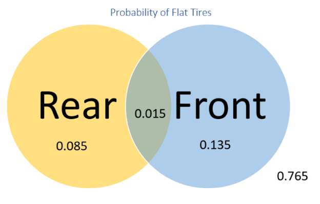
Venn Diagrams can be used to visualize probabilities
Each circle represents the probability of getting a flat tire and the outside indicate the likelihood of no flat tires (0.765). The marginal probability of getting front flat tire is (0.015+0.135)=0.15. The joint probability of both rear and front tires going flat is 0.015.
VIsualizing Outliers
Outliers are data points that are far from other data points, such unusual values distort results of a study. Some of the ways to visualize outliers are using boxplots, histograms and scatterplots.
For normally distributed data, outliers are values beyond . A z-score is a value minus the mean divide by standard deviation:
For samples with outliers, z-scores are biased as they seem less extreme. Z-scores of samples of less than 10 values downplay outliers as they have a maximum cut-off of .
Outliers can be calculated using Outlier Fences of the Interquartile Range. This method is robust to presence of outliers, given a Q1=1.714, Q3=1.936, IQR = 1.936-1.714=0.222
- Inner Fences(1.381, 2.269): IQR * 1.5 = 0.333; LI=1.714-0.333=1.381, UI=1.936+0.333=2.269
- Outer Fences(1.048, 2.602): IQR * 3 = 0.666; LO=1.714-0.666=1.048, UO=1.936+0.666=2.602
Values outside the Outer Fences are outliers, values between the Outer and the Inner Fences are suspected outliers
What to do with outliers
Removing outliers can cause results to become statistically significant, as decreasing variability decreases statistical power.
- Correct or delete measurement error outliers e.g. age=600
- Remove samples taken outside the population or abnormal conditions e.g. age of a teacher in a students sample.
- Keep natural variation outliers, such values are at least 3 standard deviations from the mean. For a normally distributed population, 1 in every 340 is an outlier.
